Docsons Security
PROJECT INFO.
- CLIENT: DOCSONS SECURITY
- DATE RELEASED: Jan 15 2024
- CATEGORIES: Website design & .Development
- TAGS: Web, Graphics, SEO
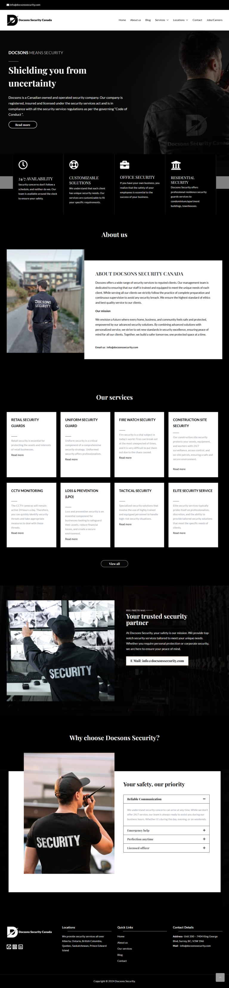
Creating a security Website: My Experience
It wasn’t all about looks to build this website—it was about making it silky and hassle-free to navigate. My vision was to create a modern and professionalized website that was joy to surf on any platform, easy to find what the visitors were looking for without confusion.
The Process: Step by Step
- Research & Planning
I began by investigating a range of security websites to determine their weak and strong areas. This meant I could identify what industry best practice was and how the user experience could be enhanced. I then developed a site map, including main pages and how these would be linked.
- Content Development
After having the structure sketched out, I worked on creating readable and engaging content. I was looking for a professional but not a scary tone. A tone that would establish credibility but not push the user away. Each section should be worth a read without bogging the user down.
- Design & Development
With content and design in place, I proceeded to build the site using WordPress and Elementor. Responsiveness was paramount, and the site would be pretty on desktop, tablet, and mobile phone. Accessibility was a concern as well, selecting colors, fonts, and layouts that would be easy enough for all to navigate.
- Testing & Launch
Before its release, I fully tested the site from page loading time to mobile responsiveness. I debugged any display errors, ensured that all links and buttons functioned as required, and optimized the site’s loading. Upon confirmation of its functionality, I released it and monitored it after release.
- Tools and Technologies Utilized
– Design Tools: WordPress, Elementor
– Technologies: PHP, JavaScript, CSS, HTML
- Challenges and Solutions
- Challenge:
Making the site fully responsive on all devices was one of the most daunting tasks. I did not wish it to be crappy and horribly running, on desktop, tablet, or phone.
- Solution:
I utilized Elementor’s responsive mode to rearrange the layout according to screen size. Cross-device testing enabled me to spot and resolve any display issues, ensuring a seamless user experience. A little more effort, but it was worth it!
- Key Results and Outcomes
- Fully functional, responsive website ensuring a seamless and enjoyable user experience.
- User praise for design ease and navigation ease.
- Media and Permissions
All photos and images have been designed by me or taken from free royalty sites with appropriate credits. For the rest of the external media, I have obtained written permission to show respect towards copyrights.